LLM Labs
The second product of Datasaur focuses on enabling teams to experiment with and optimize large language models. LLM Labs centralizes all LLM-related data in a specialized knowledge base, helps identify the best responses, and allows customization of base models to improve accuracy, relevance, and performance.
Timeline
2023 - 2025
Company
Datasaur
How I helped
Iterated the revamp concept of LLM Labs' Playground
Established the new interface direction across other functionalities
Oversaw ongoing design development and feature improvements
Hands-on contribution
View work
Tools
Figma, FigJam, Notion, Github
95%
design consistency
3
modules impacted
01
Overview
Datasaur developed its second product in response to the rise of LLMs, offering a suite of tools designed to help users optimize and enhance their LLM outputs. In the initial development, I oversaw the implementation as the product’s design PIC.
As more features were added to experiment with market targets, the UI quickly became cluttered and overwhelming for first-time users. In response to these issues, and with an internal goal to modernize the experience, management requested a redesign. I led the exploration and full design revamp of the product.
02
Process
Research
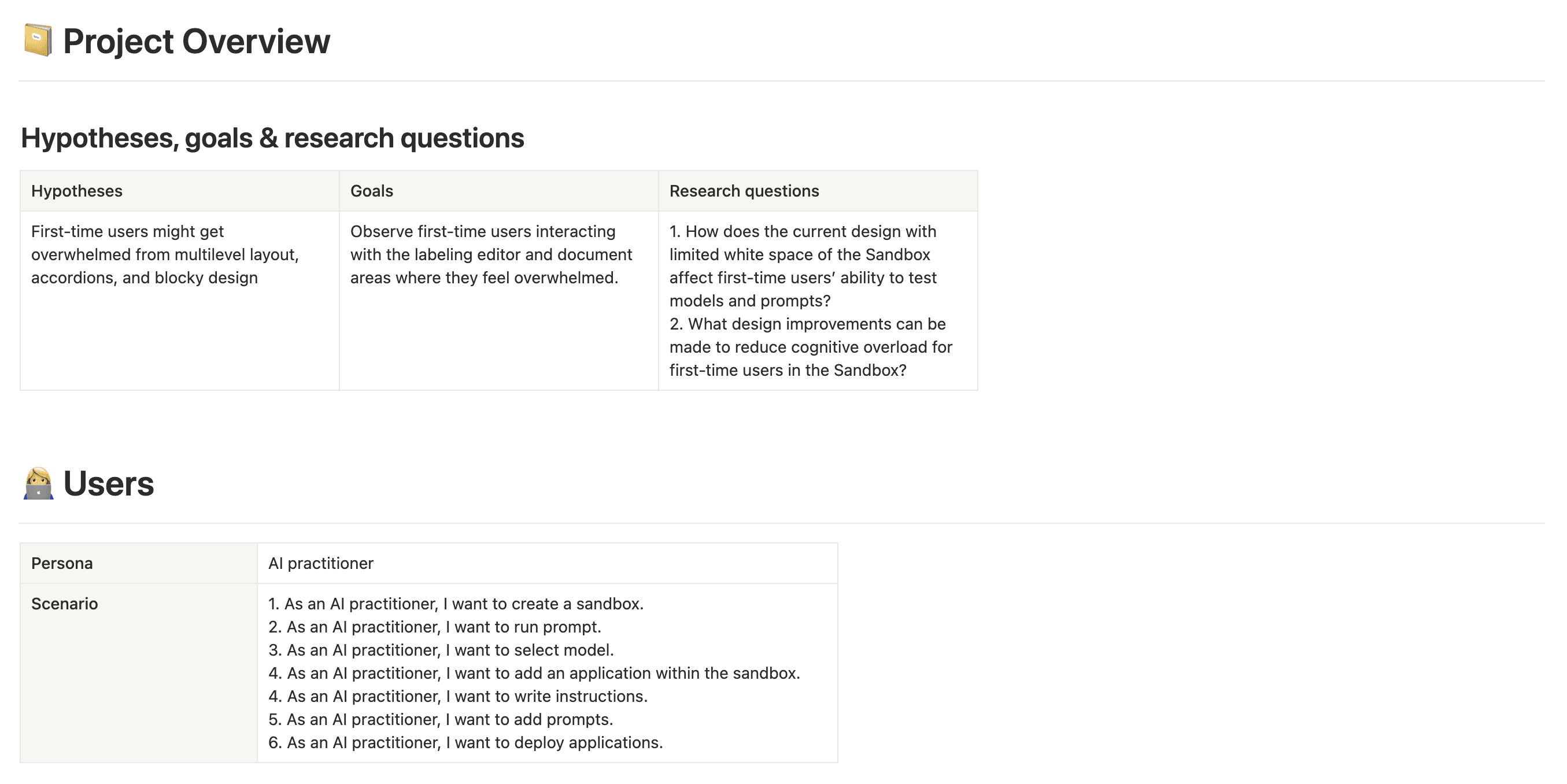
I began by analyzing the current UI of Sandbox, as it is directly tied to the success metrics—specifically, the success rate of users running prompts in the Sandbox. I documented all user stories and tested their performance in the existing interface, identifying friction points and areas for improvement. This audit provided a clear foundation for redesigning the UI to enhance usability and improve overall success rates.
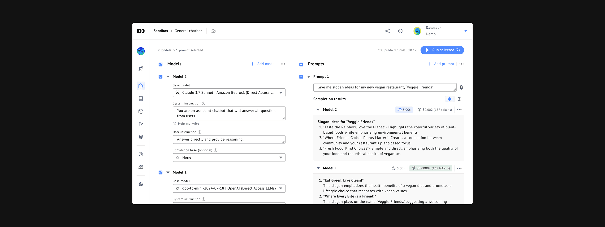
The main finding from this phase was that LLM Labs—particularly the Sandbox—had an overly dense layout. Many features were packed closely together to ensure visibility, but this resulted in an overwhelming experience for first-time users. The lack of white space and the excessive use of bordered containers made the interface feel cramped and visually heavy. Additionally, several input fields extended across the full width of the screen, even when shorter inputs would have been more appropriate.
These insights guided the redesign toward a cleaner, more focused layout that prioritized breathing room, visual hierarchy, and contextual relevance—allowing users to explore powerful features without feeling overwhelmed.

Development
I gathered visual and interaction design references based on discussions with the CEO and Marketing team to define the new UI direction. Several ideas emerged as high priority, especially given the goal to reduce user overwhelm and improve visual clarity. These included:
Increased use of white space
Reduced reliance on bordered containers
A cleaner, more minimal visual style
A grayscale-dominant theme with selective use of the primary color only when necessary
These principles laid the foundation for the design revamp. Once the direction was approved, the primary designer of LLM Labs took over to break down and implement the updates. I continued to monitor the progress to ensure each page followed the approved direction. Throughout the process, we collaborated closely with the product manager and engineering lead to gather input early and maintain alignment across the team ahead of development.

03
Results
While the redesign was still undergoing evaluation at the time of documentation, we observed several positive qualitative outcomes:
Improved clarity and usability: The updated layout introduced more white space, streamlined containers, and a cleaner grayscale theme, helping reduce cognitive load and making the interface more approachable for new users.
Modernized UI foundation: The final designs reflected the updated branding goals and created a scalable design base for future LLM Labs features.
Strong visual appeal for external demos: The polished design significantly improved the product’s visual credibility, making it more compelling during marketing and sales calls, especially when demonstrating advanced AI capabilities to clients and partners.

04
Reflection
White space is as important as the content
As designers, we often aim to surface as many features as possible to enhance usability. However, in feature-dense interfaces, that intention can lead to cluttered layouts that overwhelm users. This project reminded me that less can be more; prioritizing the most critical features helps users focus, reduces friction, and enhances the overall experience. White space isn’t wasted space; it’s a strategic tool to improve readability, hierarchy, and interaction clarity.